The Barksdale Reading Institute Brand
The Challenge
The Barksdale Reading Institute (BRI) was founded by Jim Barksdale in 2000 through a $100 million dollar commitment to improve reading scores of children in the State of Mississippi. In 2020, twenty years later, they sought a refresh on their brand that would better reflect the organization today. The brand of an organization is more than just its logo. The brand refers to how people think about an organization; its reputation, the emotional feelings it conveys, the values it is perceived to have. The BRI brand was deeply embedded in not only their print and digital objects, but also in the perception of those who have known and worked with them for many years. BRI had an established and recognized logo of a small boy reading, which they had used for over 20 years. There was a big concern around replacing this logo with a new and completely different mark.
The Solution
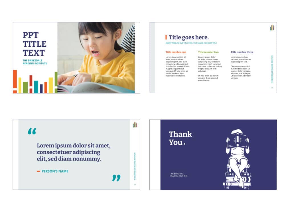
The Farthest Pixel first did a study to better understand their current brand from all aspects. We also wanted to learn what the BRI leadership and their staff wanted their brand to be going forward – how they wanted others to perceive them. We surveyed staff as well as colleagues and clients, including questions about their current logo. After receiving this information we developed a new logo we called “shuffling shelves” alongside a book seal and book plate that incorporated a slightly older boy reading a book while sitting on a stack of books. The new logo was more modern, supporting the growth of the organization, while the reading boy harkens back to their roots and their original mark.
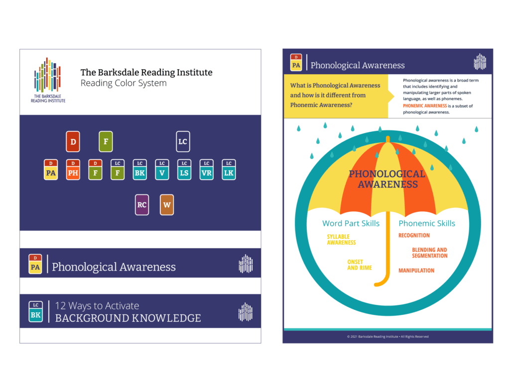
We also developed a Reading Color System to aid reading teachers in quickly identifying BRI instructional materials and their application in reading instruction.
Project Details
Team:
Kelly Butler
Grace Washko
Micaelah Scott
Kelly Gamache
Lori Catlin Garcia
Amanda Robertson
Solution:
Branding
Illustration